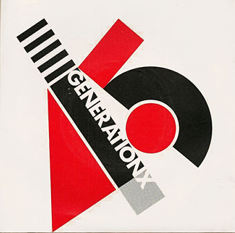
Barney Bubbles’ design for the debut single by Generation X is the earliest example I’m aware of that makes use of the El Lissitzky style. It was also one of Bubbles’ first sleeves for a punk band, and a significant break with his often florid hippy designs.
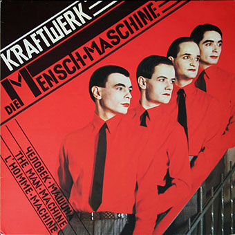
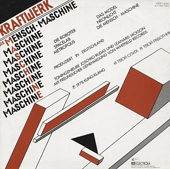
Die Mensch Maschine (1978) by Kraftwerk. Design by Karl Klefisch, “inspired by El Lissitzky”.
Kraftwerk’s seventh album uses Lissitzkian typography and graphics on its front and back covers. A very popular album with the post-punk crowd that would have been the first introduction for many people to El Lissitzky’s name. Kraftwerk still use that vibrant arrangement of black, red and white in their stage shows.
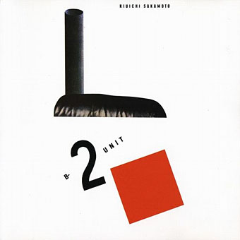
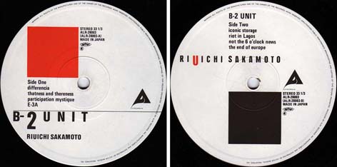
B-2 Unit (1980) by Riuichi Sakamoto. Design by Tsuguya Inoue.
More pastiche, this time borrowing from El Lissitzky’s Suprematist book for children: About Two Squares: In 6 Constructions: A Suprematist Tale (1922). The book’s two characters of a red square and a black square appear on the vinyl labels. This is a great album, incidentally, still my favourite by Sakamoto.
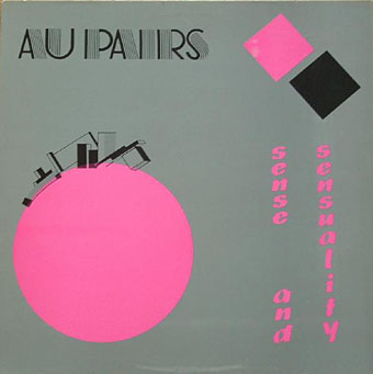
Sense And Sensuality (1982) by The Au Pairs.
Another borrowing from A Suprematist Tale only now the reds have turned pink. Not a very adept use of typography which is a considerable failing when the book the artwork is copied from contains many better suggestions.
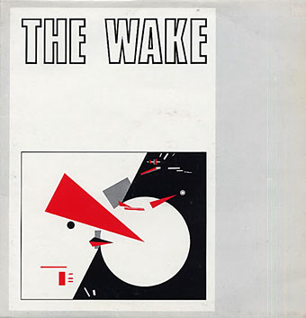
Something Outside (1983) by The Wake. Artwork: Beat the Whites with the Red Wedge (1920).
The Wake were signed to Factory Records but their career has been overshadowed by their more successful label-mates. The artwork is El Lissitzky’s famous propaganda poster with the slogans removed.
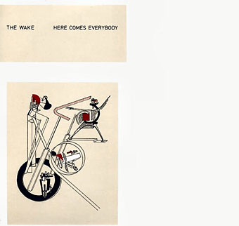
Here Comes Everybody (1985) by The Wake. Design by Jackie Gribbon & The Wake. Artwork: Part of the Show Machinery (1923).
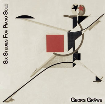
Six Studies For Piano Solo (1988) by Georg Gräwe. Artwork: First Kestner Portfolio: Proun (1924).
El Lissitzky’s “Proun” on this cover can be seen in miniature on the Wake sleeve that precedes it.
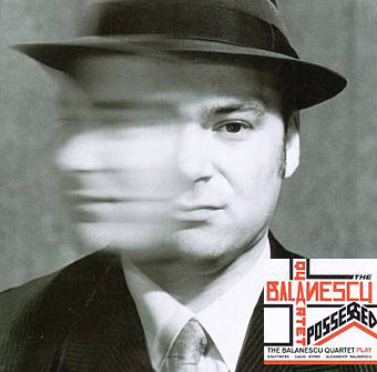
Possessed (1992) by The Balanescu Quartet. Design by T&CP Associates “with a Nod and a Wink Towards El Lissitzky”.
A minimal usage for an album which is predominantly string-quartet arrangements of Kraftwerk songs.
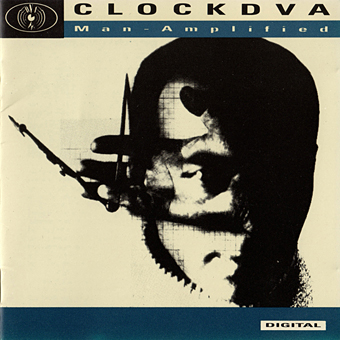
Man-Amplified (1992) by Clock DVA. Artwork: The Constructor. Self-portrait with Circle (1924).
Clock DVA by this point had abandoned their organic Industrial style for total electronics. The album title and the lyrics of Man-Amplified were evidently intended as a kind of cyberpunk upgrading of Kraftwerk’s Man-Machine concept—which may explain the El Lissitzky artwork—but the results sound rather dated today.
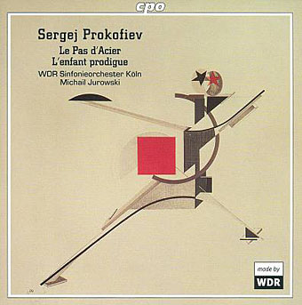
Sergei Prokofiev: Le Pas d’Acier; L’enfant prodigue (2003); Michail Jurowski, WDR Sinfonie Orchester Köln. Artwork: First Kestner Portfolio: Proun (1924).
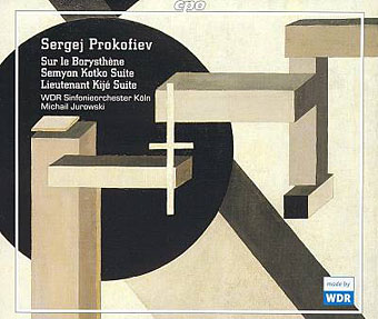
Sergei Prokofiev: Sur le Borysthène; Seymon Kotko Suite; Lieutenant Kijé Suite (2004); Michail Jurowski, WDR Sinfonie Orchester Köln. Artwork: Proun 10 (detail) (1919).
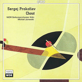
Sergei Prokofiev: Chout (2004); Michail Jurowski, WDR Sinfonie Orchester Köln. Artwork: Proun G7 (detail) (1923).
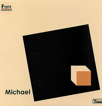
Michael (2004) by Franz Ferdinand. No designer credited. Printed in variant shades.
Many of Franz Ferdinand’s early releases either alluded to or borrowed from the avant-garde imagery and typography of Soviet artists. These two singles take El Lissitzky for a model, with This Fffire being a variation on the Red Wedge design.
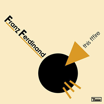
This Fffire (2004) by Franz Ferdinand. No designer credited.

No Balance Palace (2005) by Kashmir. Artwork: Design for the Abstract Cabinet (1927).
An album co-produced by Tony Visconti which perhaps explains its guest appearances from David Bowie and Lou Reed.
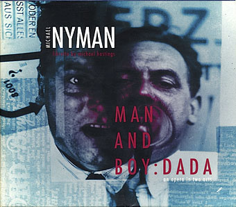
Man And Boy: Dada – An Opera In Two Acts (2005) by Michael Nyman. Design by Russell Mills & Michael Webster. Artwork: Portrait of Kurt Schwitters.
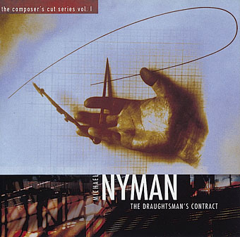
The Draughtsman’s Contract (2005) by Michael Nyman. Design by Russell Mills & Michael Webster. Artwork: Untitled (Hand with a Compass) (1924).
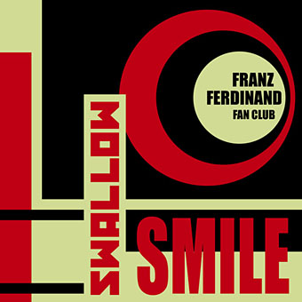
Swallow Smile (2006) by Franz Ferdinand. Design by Kris Heding.
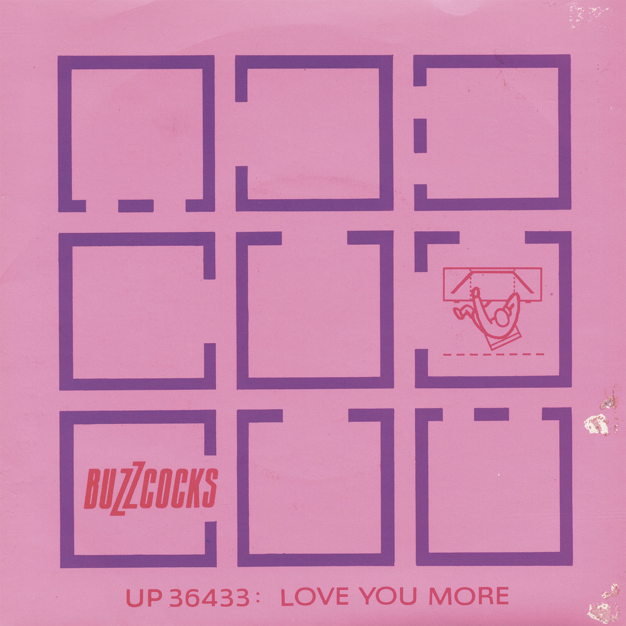
Ending as we began with a 7″ single, unless there’s more to be added. As usual, if you know of any omissions then please leave a comment.
No B-Side: Malcolm Garrett, Buzzcocks and post-punk sleeve design
In Unit Editions’ new book on punk and post-punk 7″ sleeves, designer Malcolm Garrett discusses the radical visual language he first brought to the band Buzzcocks in 1977. Featured here is his essay from Action Time Vision, alongside the text of his conversation with author and lecturer Russ Bestley
Barney Bubbles
Barney Bubbles (born Colin Fulcher; 30 July 1942 – 14 November 1983) was an English graphic artist whose work encompassed graphic design and music video direction. Bubbles, who also sketched and painted privately, is best known for his distinctive contribution to the design practices associated with the British independent music scene of the 1970s and 1980s. His record sleeves, laden with symbols and riddles, were his most recognisable output.
No comments:
Post a Comment